Please, Stay on My Website

Chances are, you already know that conversion rates are pretty low for online sales.
Indeed, when you look at your site analytics, your percentage of sales versus visitors is probably in the single digits.
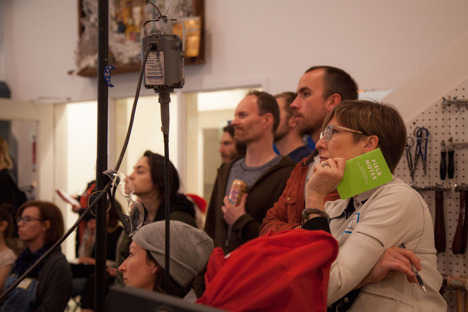
For our April Maker Meetup, hosted by betsy & iya (former Portland Made director Jim Hassert’s new workplace), Jon MacDonald of The Good schooled attendees on conversion rate optimization, or CRO, something his company has been helping businesses like Adobe, Nike, and Klean Kanteen with for ten years.


MacDonald started with a textbook definition of CRO:
A data-backed system for increasing the percentage of website visitors that convert into customers, or more generally, take any desired action on a webpage.
The first step toward CRO, ostensibly, is finding out what people do on your site before they buy. And MacDonald laid out four key types of data for figuring that out: analytics, heatmaps, user testing, and A/B testing. Most of the meetup was spent on heatmaps, with Hassert volunteering betsy & iya’s website for some workshopping. Using The Good’s eye-tracking technology, MacDonald was able to show us where customers are looking—and not looking—on betsy & iya’s homepage.


From there, he laid out some basic dos and don’ts for website design:
Do make your search option conspicuous on your homepage. People who use search have a higher CRO, so the easier it is for them to find that function, the more likely you are to generate sales.
Do put your contact information on your main page (ideally, in the lower right corner). It increases trust, thereby making the path to conversion quicker.
Do make your call to action eye-catching. Make images clickable, make text links stand out, and make directions clear to shorten paths to conversion.
Don’t put too much energy into promotional bars. Although they are increasing in popularity, MacDonald says only one typically yields results: A promise of free shipping. This is most likely because it takes the anxiety out of what a final price might be. Similarly, auto-rotating banners might seem like a great way to cram in more information, but they can be unnerving for visitors to your site.
Don’t time your pop-ups to come up immediately when a visitor clicks on your site. “Imagine if an employee [at a store] walked up two seconds in and put a clipboard in your face, asking for your email address,” MacDonald says. It’s probably not going to get the reaction you want. On a related note, don’t use shaming or condescending language on those pop-ups. Messages like, “No thanks. I don’t like to save money.” are a big turn-off to potential customers.
Don’t ask for more information than you truly need for a newsletter signup. Name and email should suffice, and the more information you ask for beyond that, the less likely you are to gain their email address.
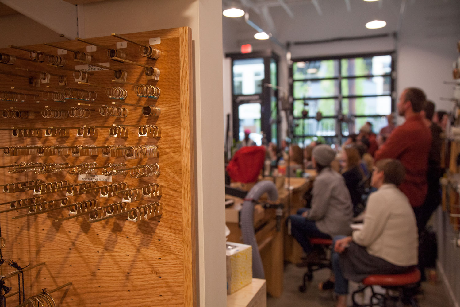
MacDonald was great at dispelling some web design myths, and he noted that having a “pretty” site is not the priority; rather, function and simplicity is what matters. He then turned to offering his services to makers with a desire to optimize their own websites before adjourning into a formal farewell to Jim Hassert by new director Meghan Sinnott. Attendees stayed after to browse the betsy & iya workshop and chat with MacDonald, Hassert, and their fellow makers.
On deck: Join us for May’s Maker Meetup on intellectual property and how to cover your assets.
__
Words by Katey Trnka
Photography by Sarah Toor